4.2. Sentinel-2 images in QGIS
4.2.1. Import Sentinel-2 images in QGIS
In order to import our data follow the steps shown in Fig. 4.2.1.1 . Click on Layer (1), Add Layer (2) and choose Add Raster Layer (3). From the Data Source Manager click on the three dotted button (4), look for the folder where you placed your product corresponding to the date: 28-9-2020 (previous the event) and add them. You can now click on Add (5) and on Close (6).
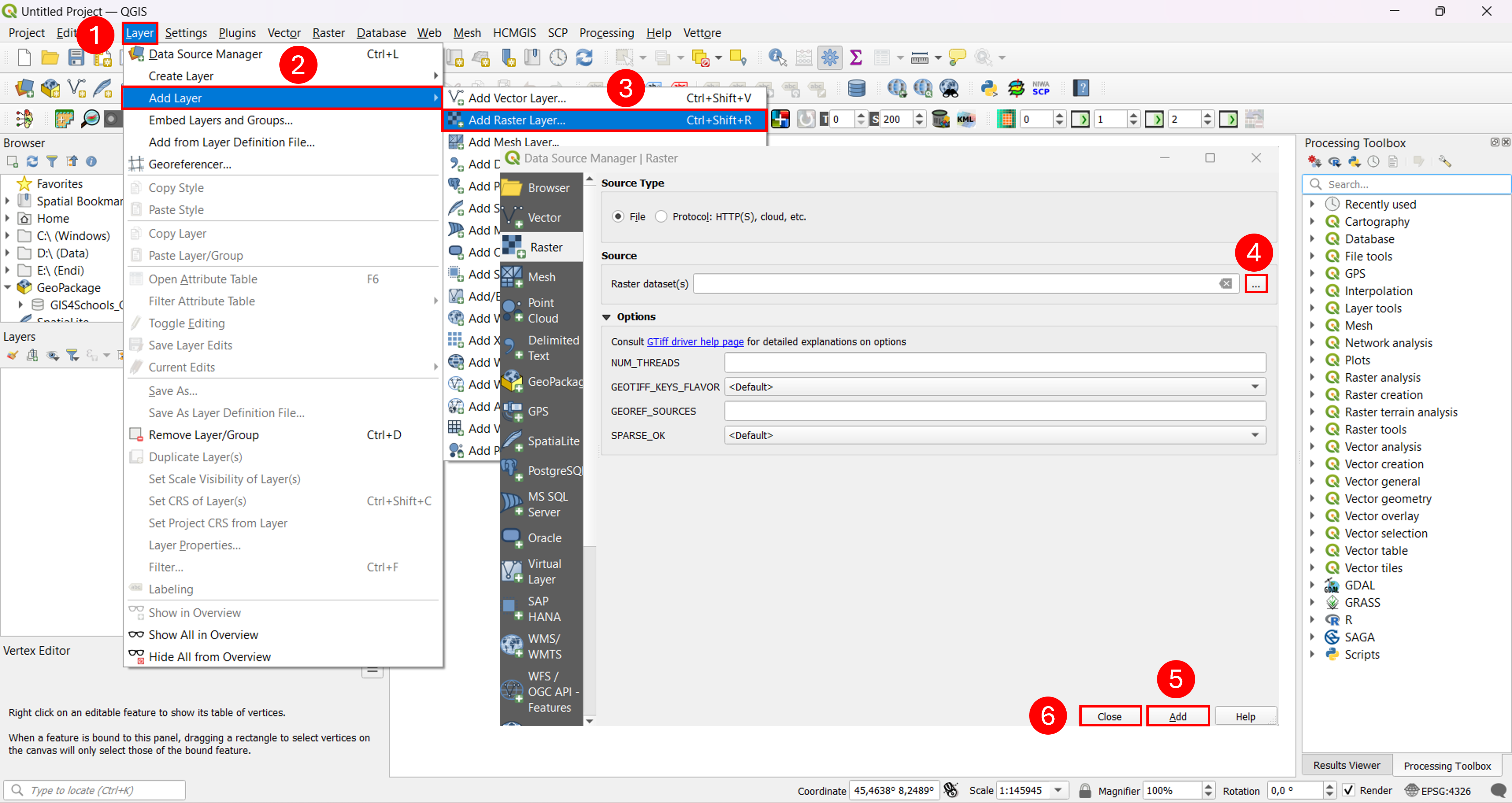
Fig. 4.2.1.1 – Import Sentinel-2 images in QGIS
4.2.2. Calculate indices in QGIS
We will now compute the NDWI index using QGIS keeping in mind that in order to simplify our computation we are not going to apply any preprocessing techniques. First of all we need to to combine all our different bands in a single virtual raster, to do so we click on Raster (1) (Fig. 4.2.2.1) , Miscellaneous (2) and Build Virtual Raster (3)

Fig. 4.2.2.1 – Build Virtual Raster pt.1
Fig. 4.2.2.2 shows the Build Virtual Raster. Choose the “Highest” resolution from the drop down menu (1) and check the box called: Place each input file into a separate band (2). Now we need to select the bands we are interested in, click on the three dotted icon (3). A new menu will pop up (4), from there you can check the box of bands we want to add (5), once you are done click on ok(6). We are now ready to run our algorithm, but first we need to give a name to our file, call it: “Pre.vrt” (7) (if you do not choose any name, the software will automatically call it: “VIRTUAL”), once done, click on Run (8). After the processing has terminated you can close the log window.
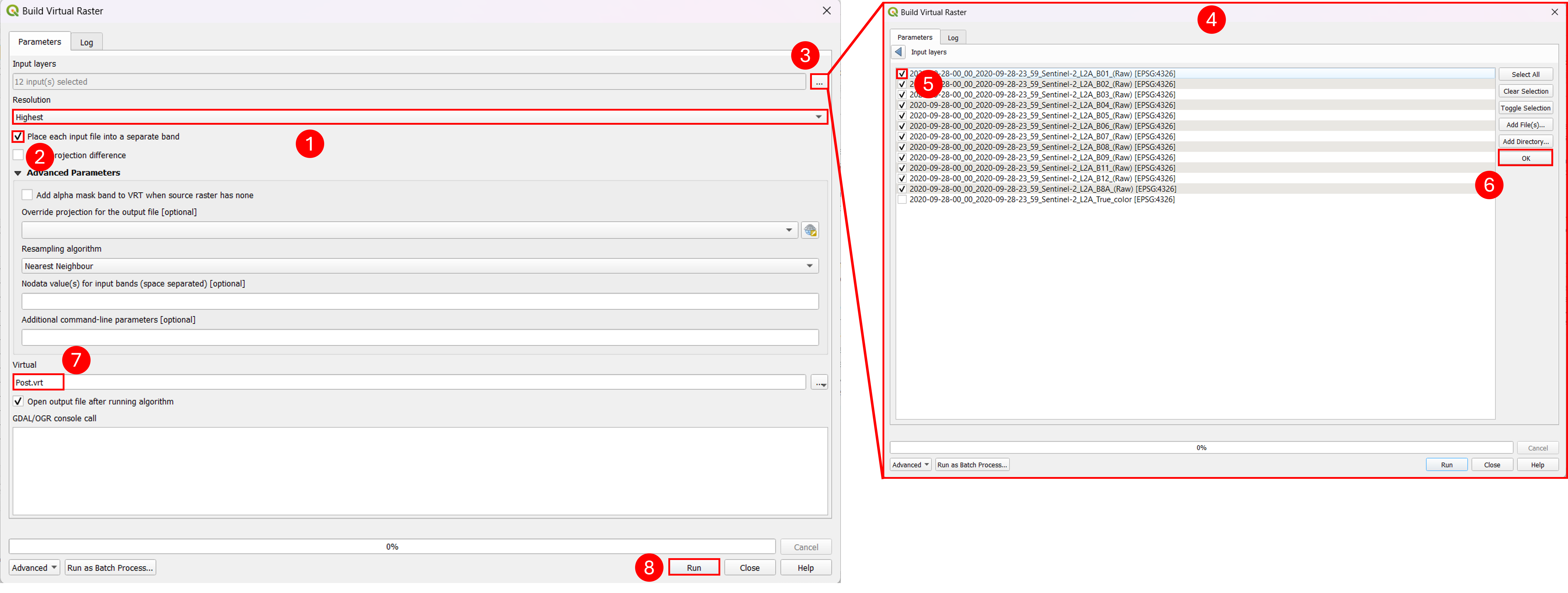
Fig. 4.2.2.2 – Build Virtual Raster pt.2
Now we will compute indexes (Fig. 4.2.2.3) , we need to click on Raster (1), Raster Calculator (2). The first thing we do is to set the location where to save our output by clicking on the three dotted button (3) and to choose the file name (suggested: “NDWI_pre”). Inside the Raster Bands we can see all bands composing our virtual raster (4). We will now need to write the equation to compute our index, in this case we will compute the NDWI, as already seen in lecture 2 , the NDWI index is computed as: (GREEN - NIR) / (GREEN + NIR) corresponding to the sentinel 2 bands: (B03 - B08) / (B03 + B08). In order to write this formula we can click on the bands (4) and on the buttons corresponding to the operators (5), the formula will be written in the Raster Calculator Expression box (6). If you had called your virtual raster as suggested (“Pre”) you can just copy the formula: “( “Pre@3” - “Pre@8” ) / ( “Pre@3” + “Pre@8” )” inside the Raster Calculator Expression box.
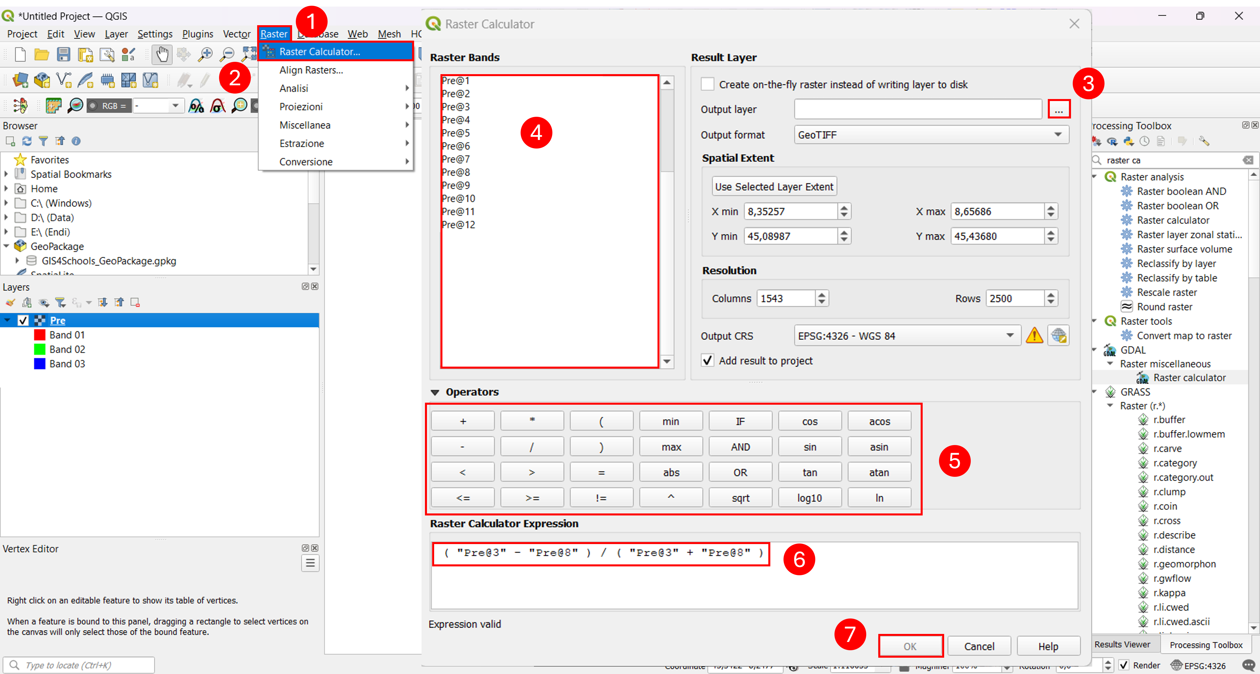
Fig. 4.2.2.3 – Calculate NDWI index in QGIS
Now repeat all steps of chapter 4.2.1 and chapter 4.2.2 but this time compute the NDWI using the data corresponding to date: 03-10-2020 (after the event), we suggest to call the virtual raster as “Post” so you can copy the formula: “( “Post@3” - “Post@8” ) / ( “Post@3” + “Post@8” )” inside the Raster Calculator Expression box.
4.2.2.1. Identification of zones with more water saturation
In order to identify zones with more water saturation we can, in a simplified way, look at the difference between the NDWI pre and post event. From (Fig. 4.2.2.4) , by looking at the scale of values assigned to the different colors in both NDWI pre and post events (1), we notice that the values are different, this will not be a fair comparison. In order to fix this problem we can change them, we right click on our index (2), click on Properties (3) and on Symbology (4). We change the Min value to “-1” and the Max one to “+1” (5) and we confirm our choices by clicking on ok (6).
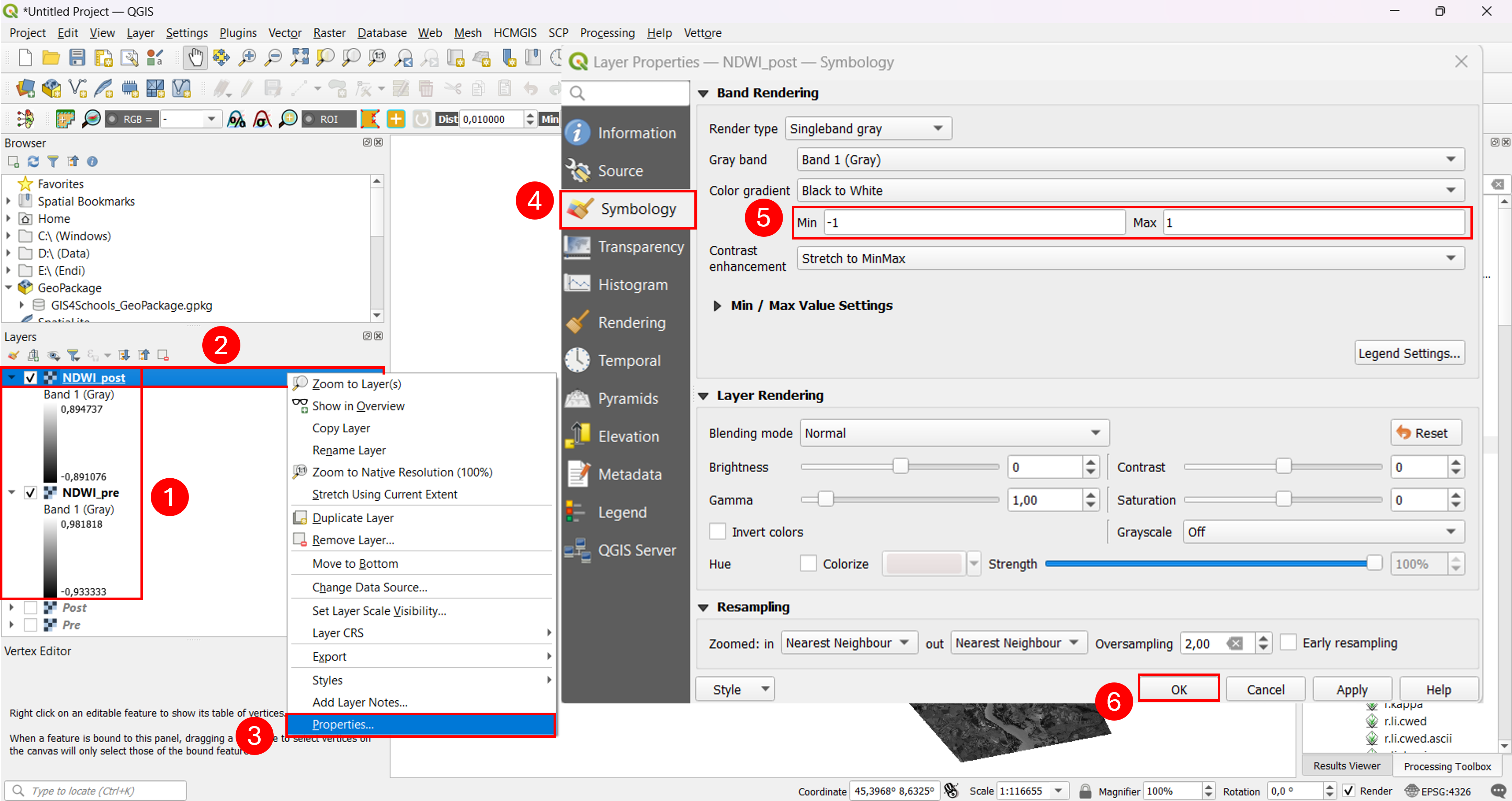
Fig. 4.2.2.4 – Fixing NDWI values range
In Fig. 4.2.2.5 we can appreciate the difference between the two NDWI.
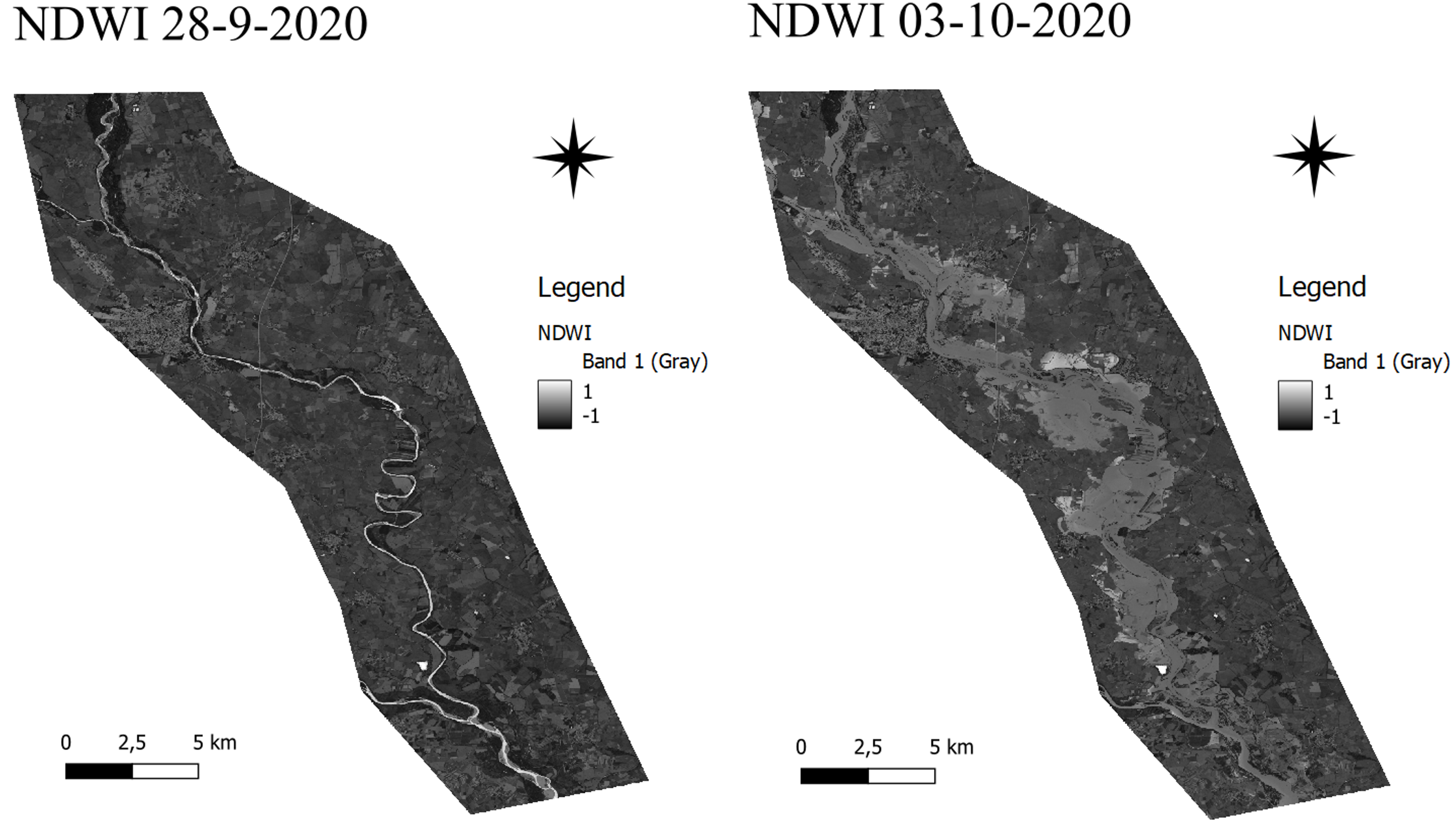
Fig. 4.2.2.5 – Identification of zones with more water saturation
4.2.3. Raster visualization in QGIS
4.2.3.1. Singleband gray
We have briefly seen the Singleband gray in chapter 4.2.2.1 with this kind of visualization we can render a layer using a single band. The first thing we can do is to set the Color gradient from “Black to White” to “White to Black” (1) (Fig. 4.2.3.1) . As already seen we can modify the Min and Max values. We can also enhance differences, within the temperature values of the raster, changing the Contrast Enhancement (3).
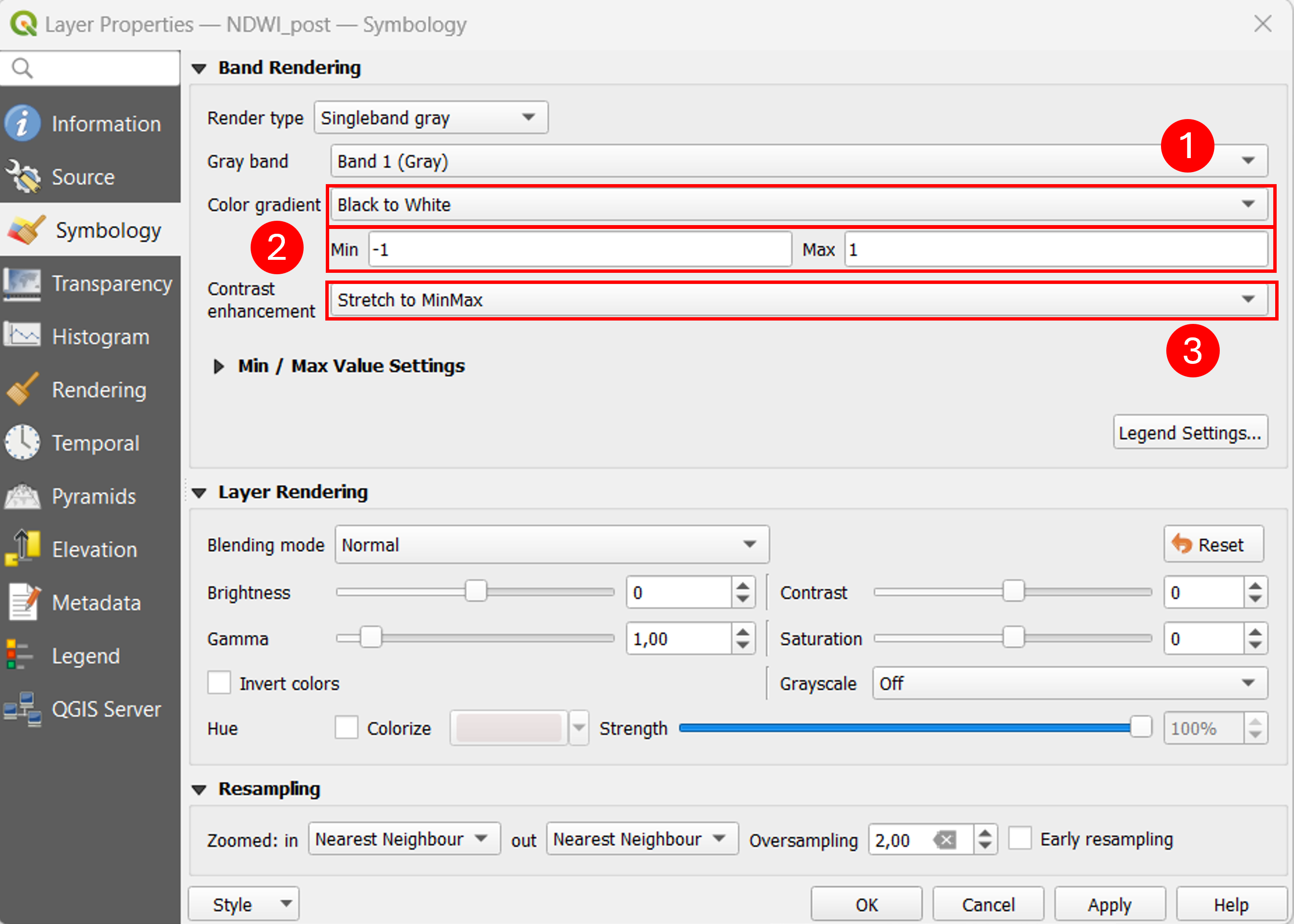
Fig. 4.2.3.1 – Singleband gray
4.2.3.2. Singleband-pseudocolor
Now is the turn of the Singleband-pseudocolor (Fig. 4.2.3.2) . From the drop down menu we can select “Singleband pseudocolor” Render Type (1), we set Min and Max respectively to “-1” and “+1” (2). Now we will change the Color ramp, we click on the downward triangle symbol (3), here we can invert the current color ramp (4) or select a new one selecting: All Color Ramps (5) and we select “GnBu” (6). If you want you can modify the selected color ramp by clicking on it (7). In this case we will leave the Mode as continuous (8), which will automatically lock the number of classes (9), using other modes we can change them. You can see a preview of the results in the central section (10), when you are satisfied with it, click on ok (11).
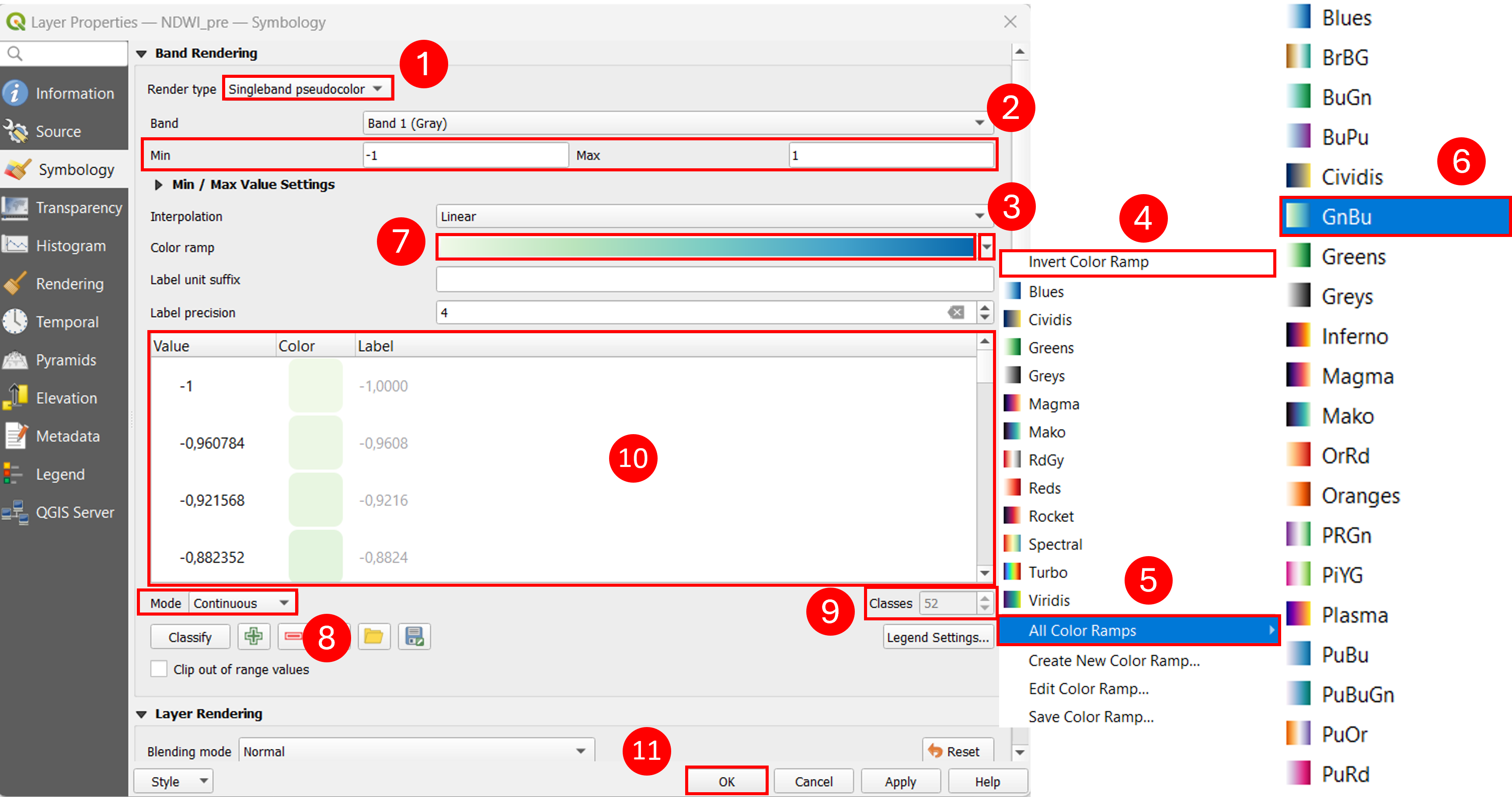
Fig. 4.2.3.2 – Singleband-pseudocolor
4.2.3.3. Paletted / unique values
This kind of rendering (Fig. 4.2.3.3) consists in representing each different value of the raster with a different color and it is often used for land cover representation. We select “Paletted / Unique values” as Render type (1). about the color ramp, we can change it by clicking on the Color ramp button (2) (by default the software assigns a random color to each unique value). In order to generate our classes we need to click on Classify (3), this procedure may take a few seconds depending on the number of unique values. This kind of representation is not particularly suitable for our data so we prefer to click on Cancel (4).
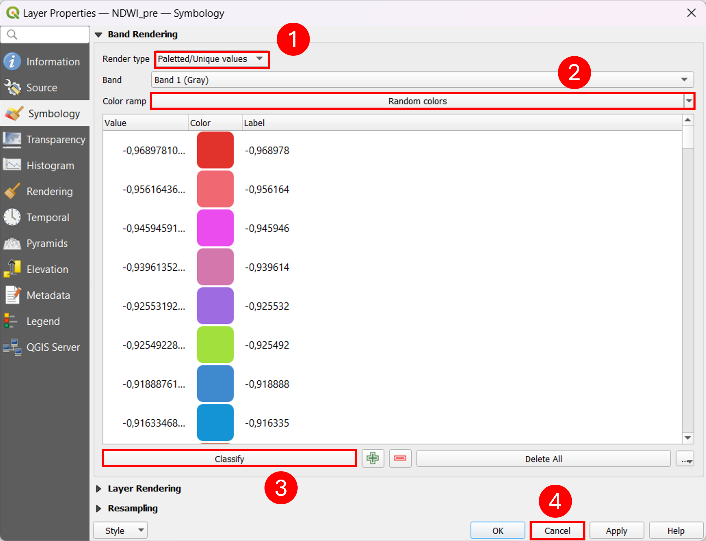
Fig. 4.2.3.3 – Paletted-unique values